THE ABBEY AT RIVERDALE


The Abbey at Riverdale was a restaurant in need for some branding.
I began by playing around with typography and abbreviations, before landing on the abbreviation 'AR'. I wanted to try and capture a posh, fancy restaurant, even if someone was to look at it at a glance, they would get that impression.
In order to try and encapture this vision, I began painting some rough brush strokes, before scanning them into the computer. From here I was able to begin applying textures and patterns to the background.


I wasn't completely set on the main logo, and so took a step back, targeting the word 'Abbey'; researching into famous abbey's within the UK (an abbey is a religious building).
After which, I created a template of 'Westminster', a famous abbey, situated in London, England. From here, I added colour, incorporated abstract strokes, and applied textures.
I was finally in reach of what I had envisioned, but something needed a final touch. The background circle that contained the texture and colouring was too sharp in contrast to the abstract paint strokes, thus resulting in myself removing parts of the circles edge, creating a more rugged, but complimentary final design.


From creating the restaurants main branding and logo, I began creating promotional graphics for the restaurant, such as :
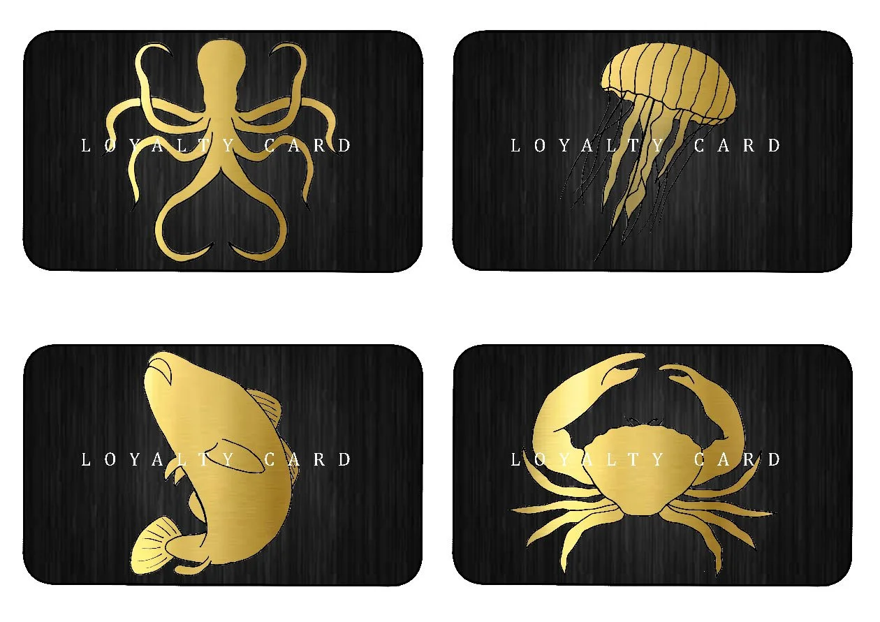
- loyalty cards
- table number stands
- takeout boxes / box handles
- menu cards
With these various graphic products, I incorporated sea creatures, as typically sea creatures are signified and associated with being a delicacy, portraying the restaurant as very posh, elegant, and professional.


